Boost Your Shopify Conversion Rate: 6 Proven Strategies
If you click to purchase a product or service based on our independent recommendations and impartial reviews, we may receive a commission. Learn more
Got the traffic, but missing the mark when it comes to conversion rate optimization for your ecommerce site? Are you struggling with a meandering – or downright mediocre – conversion rate? Have you used Shopify’s website builder to build a beautiful online store?
We can help! Below, we’ve calculated and curated our top six strategies for boosting your Shopify conversion rate – from landing page to checkout – and collected them here.
So read on to learn how to increase your conversion rate on Shopify – and unlock the juicy benefits it can have for your brand, business, and bottom line.
1. User Experience Optimization
To make your Shopify store more conversion-friendly, you must first make it more user-friendly. This means putting on your UX (User Experience) hat – and placing yourself in the shoes of your website’s visitors.
UX involves not only what you’ve got on your Shopify site, but how easy and intuitive it is to use. And, for conversion purposes, this is vital – because if your Shopify website’s structure isn’t logical, if the flow of information and content isn’t cohesive, or if it simply doesn’t make sense – your visitor will fall at the first hurdle, let alone convert!
So what can you do to improve your Shopify store’s navigation? To start, try:
- Implementing a responsive, mobile-friendly design: responsive sites detect what device your visitor is using, and automatically adjust your website’s layout accordingly. Fortunately, many of Shopify’s themes come pre-optimized for different screen sizes, with different elements – such as images, buttons, and menus – that adapt seamlessly to various screen sizes and resolutions.
- Streamlining your Shopify site’s navigation: ensure your website has an intuitive layout, that follows navigation best practices and allows your visitors to locate exactly what they’re after – without the hassle. That means adding a search bar, using drop-down menus to stack related content, and offering a sidebar to help visitors locate the right information.
- Adding high-quality product images and videos: take pictures of your Shopify store’s products from multiple angles, and provide a zoom functionality to let shoppers take a closer look. Product videos are an excellent way of demonstrating a product’s finer features and functionality – and showing off how it looks, and works, in real life.
- Writing better product descriptions: clearly highlight your product’s key features, benefits, and finer points and specifications. And take advantage of the “Shopify Magic” tool: create detailed AI-generated product descriptions in a flash – and use headings, bullet points, and bold text to make it all scannable.
To learn more about how to create a responsive website, check out our guide – or explore why it’s the future of mobile websites.

2. Conversion-focused Landing Pages
Your landing pages are a key cog in your Shopify store’s machinery. They’re how your customer will find you, and they’re often the first touchpoint your customer will have with your brand – so they need to be good.
Of course, your landing pages are also where your customer will decide whether to convert – or not. So how can you set them up to be as enticing and compelling as possible?
- Customize your landing pages for specific products or promotions: why have a “one size fits all” landing page when you can have multiple – each dedicated to a particular deal or discount your Shopify store is running? To build targeted, tailored landing pages for different products or campaigns, use Shopify’s page builder – or enlist one of the many third-party Shopify apps, such as Shogun or PageFly, to help out.
- Craft clear, attention-grabbing headlines: hook your Shopify landing page’s visitors with compelling, captivating copy that captures the essence and unique selling points of the product, or promotion, you’re advertising. Remember to always communicate not only the features of a product but the benefits. Don’t sell the mattress – sell the good night’s sleep!
- Make your call-to-action (CTA) buttons prominent and persuasive: CTA buttons are, quite literally, where conversions happen – so make that user want to click! CTA buttons stand out when their color contrasts vividly with the page behind them, and when they use persuasive, active language (like “Get Started Today” or “Claim Your Discount”). Ensure they’re placed strategically too, with one CTA above your website’s fold. Learn how to write a call to action in our full guide!
- Include a pop-up to grab your visitors’ attention: a thoughtfully placed, well-considered pop-up – particularly one offering a deal or other incentive – can encourage engagement and drive conversions. You can use a pop-up on your Shopify store to bolster your mailing list, collect feedback, or promote your latest products.
Your landing pages aren’t the only part of your Shopify store you should be looking to optimize. So explore our guide on product page optimization to give your whole website a glow-up!

3. Streamlined Checkout Process
Alright, so your customer has landed on your Shopify store and clicked your CTA button. Nice work! But there’s still more to do to get them over the line, and this part of the process – the checkout phase – is where you’ll have to be at your most compelling.
Want to make your Shopify store’s checkout process more conversion-friendly? Here’s how:
- Simplify the checkout flow: avoid asking for unnecessary information, and only ask your customer for the essential details needed to pay. A single-page checkout can help here, as can a clear progress indicator to show users how close they are to completing their purchase (Update: Shopify has already implemented all-in-one checkout pages!)
- Enable guest checkout: offer the ability for customers to make a purchase without having to set up an account to do so. This’ll reduce friction and speed up the process – although you should still give customers who want to make repeat purchases the option to create an account to save time in the future.
- Let your customers pay – their way: Shopify supports a wide range of payment gateways (including PayPal, Stripe, Authorize.Net, Apple Pay, and Google Pay) which allow you to offer your customers a plethora of payment methods. By catering to their exact payment tastes, you make it more likely they’ll follow through with the purchase.
Want more tips on how to optimize your checkout pages? We’ve got you covered!

4. Personalization and Targeted Marketing
According to Epsilon, 80% of customers are more likely to buy from a brand that offers a tailored experience. So how can your Shopify store embrace the power of a personalized shopping experience – and leverage it to send your conversions sky high?
To begin with, try segmenting your customers based on their behavior and preferences. By collecting data about how your customers interact with your website, you can segment them based on their actions and the products they’re most interested in.
Shopify provides a comprehensive set of tools for tracking customer activity – including pages visited, products viewed, and purchase history. You can then use this information to segment your customers into buckets such as:
- New visitors
- Repeat buyers
- High spenders
Or simply customers with specific interests! With this information, you can provide personalized product recommendations, craft tailored abandoned cart recovery emails, or recapture commercial, high-intent traffic on your site.
And, through integrating your Shopify store with popular social media platforms, you can retarget customers across Instagram, TikTok, and other platforms to remind them of the products they took an interest in on your site.
Need some more? Check out our 11 Actionable Tips for Improving Ecommerce Conversion Rates.

5. Social Proof and Customer Reviews
According to Powerreviews, 75% of customers search for testimonials and reviews online before making a purchase. And, particularly in the latter stages of the sales funnel – when a customer is almost over the line, and just needs that final bit of convincing – social proof is vital.
To leverage social proof and customer reviews to boost your Shopify store’s conversion credentials, experiment with:
- Displaying customer reviews and ratings prominently: share these on both your landing pages and product pages. Adding testimonials to your website – and encouraging new customers to leave five-star ratings and reviews, too – is powerful social proof, and vouches for the quality and reliability of your products.
- Encouraging customers to share user-generated content (UGC): this adds authenticity and reputability to your brand and products simply because it doesn’t come from you. UGC can include images or videos of your customers enjoying your products. Often, customers will upload this content to their own social media platforms – it’s your job to find it, engage with it, and add it to your website!
- Add trust seals and certifications: these include the logos of payment providers or big clients, or reminders of industry awards you’ve won. A valid, functioning SSL certificate is also important here because it’ll demonstrate your Shopify store’s legitimacy (in the eyes of both users and search engines).

6. Performance Tracking and Optimization
Equipping your Shopify store with all the conversion-boosting tools and techniques we’ve discussed here is a brilliant start – but it’s only one part of a successful sales strategy.
That’s because, unless you’re tracking and measuring your site’s traffic and conversion rate over time, well – how will you know you’ve been successful?
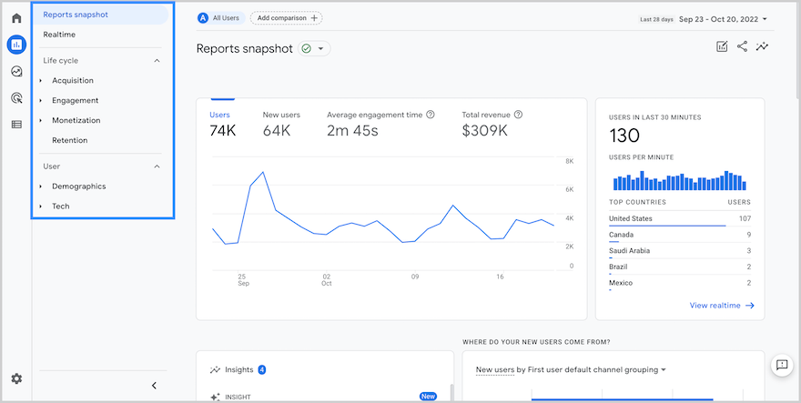
To get the ball rolling, you’ll need to set up Google Analytics 4 (GA4) to start tracking the metrics – including traffic, bounce rate, conversion rate, and time on page – most important to your Shopify store’s progress.
We won’t go into too much detail about the process of setting this platform up – after all, we do that much better in our guide to how to set up GA4 – but you will then need to add Google Analytics to Shopify. (Fortunately, there’s an article for that, too!)
With that basic website tracking infrastructure in place, start to play around with more detailed analytical and investigative tools, including:
- A/B testing different elements of your website: this involves creating variations of aspects of your website’s content – including headlines, CTA buttons, and product images – to assess which one performs better. For this, Shopify offers some built-in tools, but you may get a more seamless experience via a third-party app.
- Using heatmaps and session recordings: by illustrating visually how your users are clicking or scrolling through your site – and where they’re spending the most time on it – these tools help you understand how users are interacting with your store. Integrating with third-party Shopify apps, including Crazy Egg and Hotjar, is your best bet.
- Monitoring and optimizing your website’s speed and performance: slow-loading websites tend to be the ones with high bounce rates – and low conversion rates. To give your Shopify site a pace injection, compress its images, use content delivery networks (CDNs), and utilize browser caching. Also, get to grips with tools like Google’s PageSpeed Insights or GTmetrix to measure your website’s performance.

Shopify Conversion Rate Optimization: A Summary
To recap, the best ways to boost your Shopify conversion rate are:
- Optimizing the user experience
- Creating conversion-focused landing pages
- Streamlining the checkout process
- Personalizing and targeting your marketing
- Adding social proof and customer reviews
- Tracking your website’s performance – and tweaking it accordingly
Struggling to decide exactly where to begin? Well, how about with a full-scale Conversion Rate Optimization (CRO) audit: a process designed to evaluate your Shopify store’s ability to convert, and define what’s working well (and what could be working better!)
To get you started, we’ve pulled together an ultimate guide to auditing your website’s CRO – in just 10 simple steps!

Leave a comment