How To Design a Website in 2024: 7 Steps To Get Started
If you click to purchase a product or service based on our independent recommendations and impartial reviews, we may receive a commission. Learn more
First impressions matter, so it’s important to take the time to design your website properly. Website builders like Wix provide plenty of editing support and stunning templates, but we’re here to help you from start to finish, from finding your site’s purpose to setting a color scheme to adding pages.
You’ll want to consider your website’s aim ahead of time and adapt your design to suit your business, branding, and target audience. After all, a poor website design could result in the loss of traffic or sales – it isn’t something to rush.
But, where do you start? What tools do you need? We’ve pulled together a seven-step guide to walk you through designing a website from the ground up.
What You Need To Design a Website
Before you can even start designing, you’ll need a platform to build your website. We carry out regular testing of the market’s leading website builders to help you find the perfect fit for your needs, whether you’re looking to create a personal website or build an online store.
Here are our top website builders for 2024:
 |  |  |  |  |
| Wix | Squarespace | Shopify | GoDaddy | Hostinger |
| Overall Rating 4.8 | Overall Rating 4.6 | Overall Rating 4.4 | Overall Rating 4.3 | Overall Rating 4.3 |
| Starting from | Starting from | Starting from | Starting from $9.99 | Starting from
$2.99 + up to 3 months free (on 48-month plan) |
| Free plan or free trial Free plan | Free plan or free trial 14-day free trial | Free plan or free trial 3-day free trial | Free plan or free trial Free plan | Free plan or free trial 30-day free trial |
| Number of templates 900+ | Number of templates 150+ | Number of templates 150+ | Number of templates 200+ | Number of templates 150+ |
As you can see, Wix is our top-rated website builder overall, offering well-rounded features and 900+ professionally designed templates that cater to a variety of industries.
Website builders, like Wix, package web hosting into your subscription so you don’t need to worry about sourcing a hosting provider yourself. However, if you choose to design a website with a CMS platform, such as WordPress, you’ll need to purchase a plan from a web hosting provider before you can publish your site.
You’ll also need a domain name – this makes your website appear professional and helps repeat visitors recognize your website. Website builders often include a free custom domain name for the first year, but some, like Shopify, will require you to source and pay for a domain name separately. This can cost roughly $10-$20 per year, depending on your chosen domain.
Finally, we recommend gathering your brand assets and information before you begin designing your website. Having a business logo, visuals, and key content to hand will help you save time as you get set up.
#1. Set Your Website Goals
The first step in designing your website is to define your website and set your goals. With a clear vision in mind, you’ll reduce the risk of confusing your visitors as they navigate your pages. Here are a few things to consider:
- What is your site’s purpose? – Get an understanding of your industry and figure out what you hope to achieve with your website, such as showcasing your products or creating an online community
- Do you have a unique selling point? – Think about what will make your website stand out in the market and avoid replicating the style and look of your competitors
- Who is your target audience? – Your website’s design should reflect your goals and your audience, e.g. if you’re prioritizing customer engagement, there should be features like live chat and contact forms readily available
- What actions do you want visitors to take? – Is your website largely informational and is that content easy to access? Do you want people to purchase products? Should you add a button signposting an action? Would moving your newsletter sign-up form make it easier for visitors to spot?
Answering these questions will give you a clear idea of the type of site you’re going to design and the key pages you should include.
While your site should be tweaked to reflect your unique goals, the foundational pages you create will depend on the type of site you’re designing:
- Ecommerce: when designing an ecommerce website, you’ll want to include logically categorized product pages, a search bar, and an easy to use checkout with payment methods that are relevant to your customers.
- Portfolio: a portfolio website doesn’t need many pages to be effective. It should clearly show your projects, give information about you and your experience, and have a contact form for clients to get in touch.
- Business: a business website will feature key business information and achievements, so it should have strong About and Testimonials pages, as well as contact and booking forms if relevant.
- Events: event website templates should include pages that anticipate and answer any queries that may arise about your event, such as FAQ pages, location information, instructions for registering or buying tickets, and contact information for further questions. The site should include clear CTAs that encourage visitors to get tickets or sign up for the event. Downloadable brochures and image galleries will also help to give information about the events.
- Blog: a blog website design needs to display a lot of text in a digestible way. Your design choices should prioritize showing your blog posts in a way that is easy to navigate through categories and tags. For a personal touch, include an About page and social media icons.
#2. Build Your Brand Identity
It’s essential to build your brand identity before you start designing. This will ensure your website’s look remains consistent, no matter which page users visit. And, don’t overlook this step if you’re building a personal website either – a clear online identity applies to both individuals and businesses.
Tone of Voice
Your website’s tone of voice needs to align with your business and website goals. Do you want to sound professional and formal? Do you want to sprinkle jokes into your site’s copy with a playful and friendly tone? The tone you decide on brings your website to life for visitors – it can make your brand or business seem approachable, inspiring, and authoritative.
Naturally, your tone of voice can adapt and change to suit its environment. Say you pick a relatively formal tone for your website, you can absolutely lighten things up for social media posts or add more bold and engaging copy into your weekly newsletters.

When testing website builders, I noticed that a lot of recently developed AI tools will adopt a set tone of voice when generating text. For example, I used Shopify Magic to create some product descriptions and I could add a custom tone or choose from a list of preset options for my prompt, including persuasive, daring, and supportive.
Color Scheme
Choosing a color scheme is incredibly important when designing a website – a signature color, like Coca Cola’s famous red, can set your brand apart from the competition and make your brand instantly recognizable.
However, certain colors are perceived differently by people. For example, green can represent wealth, tranquility, health, and nature. This could be ideal for a wellness business or spa looking to take online bookings thanks to the relaxation effects of the color. And, gray can symbolize simplicity, calm, futuristic, and logic – this color is best suited for technology brands and industrial businesses.

We recommend choosing one dominant color, with two or three secondary colors to complete the palette. You can set your color scheme based on your branding or products, or choose a variety of colors based on what looks nice! If you need some inspiration, Pantone recently revealed “Peach Fuzz” as the 2024 Color of the Year.
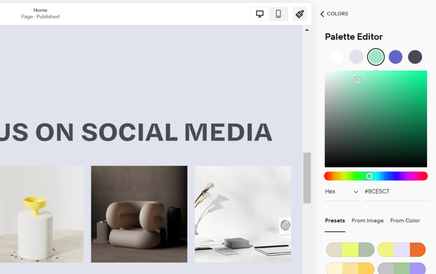
I started building a website with Squarespace and was impressed by the color palette editor. If you have an established brand with set colors already, you can easily input the individual hex codes. Alternatively, I could choose from preset color schemes designed by Squarespace, or even draw a palette from an uploaded image or single color.
Font Type
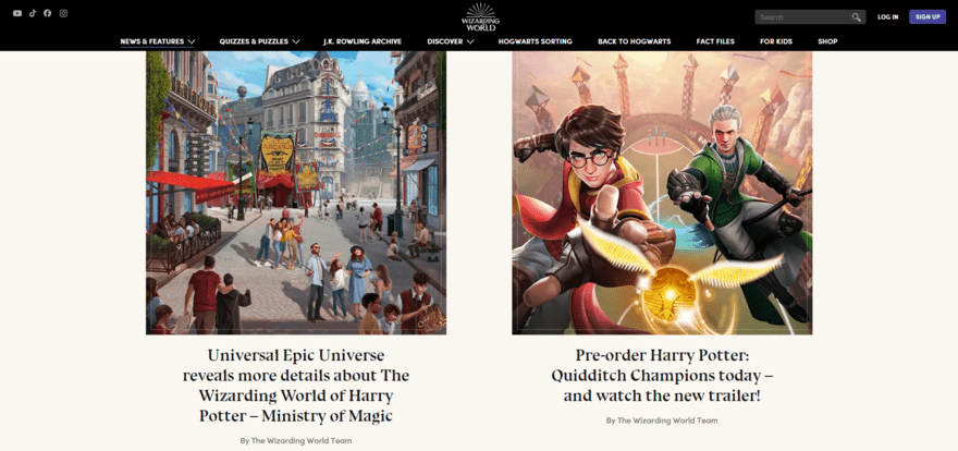
Now, you need a font style to complement your website’s tone of voice and color palette. Businesses and websites that want to appear professional and serious will gravitate towards classic styles of font, such as Arial and Helvetica.
A modern or more playful website might want to explore abstract or quirky fonts instead. Website builders, like Wix, offer a variety of fonts to choose from when editing, so you can easily test things out before committing to a style.
Just remember, strike a balance between an interesting font type and readable content – you don’t want to alienate any readers by using a font that’s impossible to decipher.
#3. Select a Template
Now that you’ve set your website’s goal and created a clear brand identity, it’s time to pick a template. A template or theme creates the structure of your website, shaping the layout and overall appearance.
There are several ways to start the design process of your website, but your options depend on your chosen website builder or platform. You could:
- Create a design from scratch – if you’ve got some building experience, this is a great way to design a unique-looking website
- Choose a template – website builders make it easy for users by offering professionally designed and high-quality templates
- Use an AI website builder – share your vision with an AI tool and hand the design process over to the computer
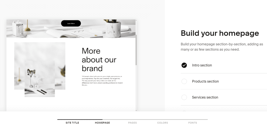
For most users, we recommend choosing a template, especially if you’re a beginner. Website builders, like Wix or Squarespace, offer a range of high-quality and customizable templates that come with example content included. This helps you get a good idea of what your site will look like at the end of the design process.
You simply have to swap our elements, images, and text to suit your needs.
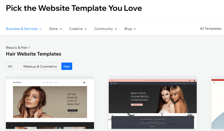
Wix has the best selection of templates, with over 900 on offer. These are divided into industry categories or website types, such as “Wellness” and “Photography.” During our testing, this made it really easy for us to browse and find a relevant template.
#4. Customize Essential Pages
Once you’ve settled on a template, you can begin to tailor your website with relevant pages. Most templates come with a selection of pages already built in, including a homepage, about page, and contact page – these are the essential three.
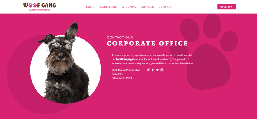
Of course, if you’re looking to build an online store, you’ll also want to add pages for your storefront and products. Website builders will usually add these automatically after the onboarding process.
If certain pages aren’t included after setup or with your chosen template, we recommend also adding an FAQ page (to help users get answers easily), a blog (to show expertise in your niche), and a review or testimonial page (to build brand trust).
As you customize your pages, remember your brand identity and target audience. Add sections and elements that make sense and ensure your key information is readable and accessible. You don’t want visitors to hunt around to find your contact details or your store’s opening times.
#5. Optimize Your Content
After adding your pages and content, you need to think about optimizing your site design. A well-optimized site improves the overall user journey and helps search engines, like Google, look favorably on your site.
Here’s what we recommend:
- Make your site user-friendly – Consider the structure, layout, and user experience when designing your site so it’s easy to navigate
- Apply SEO best practices – Lots of builders generate sitemaps and let you tweak your page’s metadata with a click of a button, but we rate Wix as the best SEO website builder thanks to its keyword support, SEO resources, and personalized SEO checklist which flags areas for improvement
- Guarantee accessibility – Your website should be accessible for everyone, and not just designed with search engines in mind, so make sure your text is scannable, use plenty of whitespace to break up sections, and add alt text to images
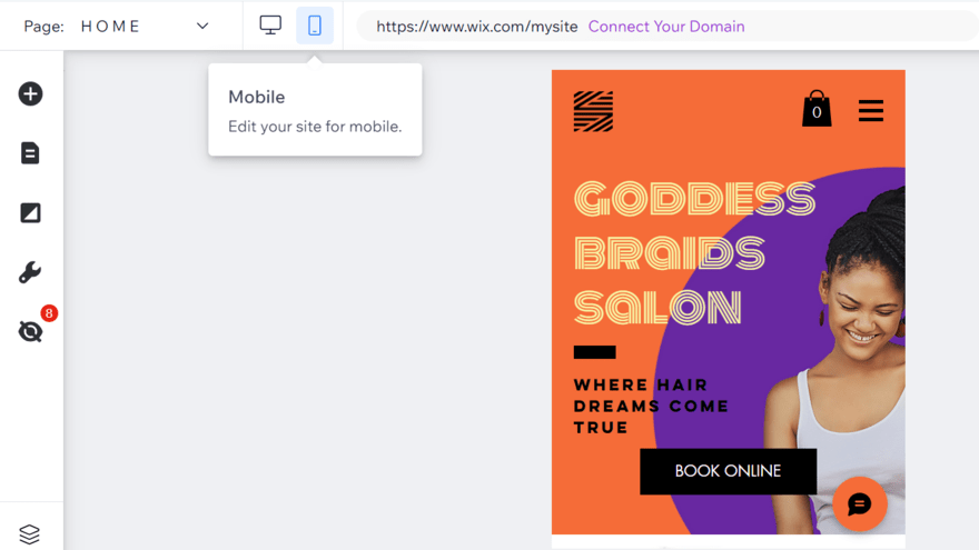
- Consider mobile users – Not everyone will visit your website from a desktop (about half of all web traffic comes from mobiles), so preview and rework your site’s design for different devices
- Speed up your website – Compress your images or large files, and don’t overwhelm your pages with tons of content, to ensure your website’s load time doesn’t leave visitors with a frustrating experience
#6. Launch Your Website
Feeling happy with your website design? You’ve got a clear vision, you’ve established your brand identity, you’ve chosen a template, added pages, and optimized your content. It’s finally time to check everything’s in working order before you publish your site.
We recommend asking your family, friends, colleagues, or even the general public to test the site in preview mode. This is a great way to get fresh eyes on your design, pages, and content. By this point, you’ll have worked closely on the site for some time, so you’re less likely to spot errors or notice any issues when navigating the site you’ve designed.
When testing your website, there are a few key areas to look at:
- Links – Make sure all of your links are set up properly and direct visitors to the right page
- Content – Check that what you’re trying to say is clear and readable
- Navigation – Can visitors find their way around your website? Can they return to the homepage easily?
- Different views – View your website using different devices to make sure your design looks okay on desktop, mobile, and tablet
- Loading speed – Test that your pages don’t take longer than a couple of seconds to load (review the section above to help optimize your website)
Once you’re satisfied with your website’s design, publish it! And, don’t forget to spread the word by sharing your new website with your network. We recommend building some buzz across social media before revealing your beautiful website to the world.
#7. Gather Feedback & Evolve
You might think you’re done, but designing a website doesn’t stop once you publish it. Nothing’s ever perfect from the get-go, so you’ll need to monitor your site’s performance and request feedback regularly.
Maybe you’re thinking about rebranding your business down the line, or you’ve spotted a new design trend, or you’ve noticed a change in your audience – whatever it is, you have to keep working and improving your website.
Most website builders have built-in analytics or integrations, like Google Analytics, so you can track things like page views, the time users spend on each page, your site’s bounce rate, and your store’s conversion rate.

For example, Hostinger’s website builder includes an AI heatmap tool so you can easily track which elements of your site attract the most attention from visitors. This is a really neat tool if you’re looking for areas to improve on your pages.
Alternatively, you could reach out to engaged visitors, customers, and friends to see what they think needs some work. Requesting regular feedback is a necessary step for website owners if they want to keep on top of pain points or issues.
Overall, monitoring your site’s performance and audience behavior helps draw attention to areas that need tweaking. You don’t need to make changes every single day, but your website needs to evolve and adapt to the times. Visitors will appreciate it if their feedback is listened to and actioned.
Should You Hire a Web Designer?
If all of this seems overwhelming to you, consider hiring a web designer. There are a few things to consider before deciding:
- Do you have the budget? Using a website builder is considerably cheaper than hiring a web designer, so make sure to factor in costs before committing to this design route
- Do you have the time to design a website? If not, a web designer can help free up your schedule so you can focus on other business matters instead
- Are you confident in your building skills? Hiring a web designer can give you peace of mind if you’ve got limited web design experience, but with the user-friendly website builders and AI tools available in 2024, everyone should be able to build a website, no matter their skill level
How to Design a Website: The 7-Step Journey
Now you know how to design a website – you can break the seven-step process down into three key stages.
To recap, you first want to understand your website’s goals and prep your materials, such as brand assets and content. This will give you a good foundation to build from.
The second stage is when you physically start designing your pages and elements, whether you use the help of AI or build your vision from scratch. This is when you implement your color scheme, font type, and tone of voice – and also play around with your copy and imagery to get them in the right position.
Lastly, the third stage is all about getting that site live for visitors and adapting your design when necessary. It’s important to ask for feedback regularly and make changes that suit your website’s visitors and customers.
24 comments